Abour Safer
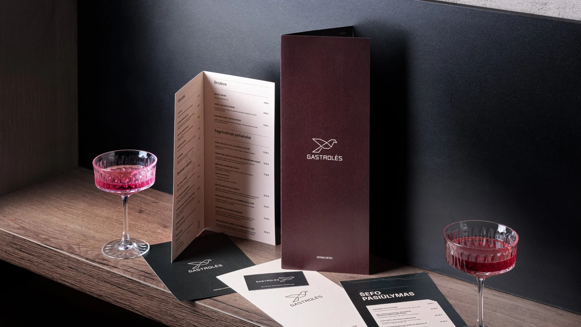
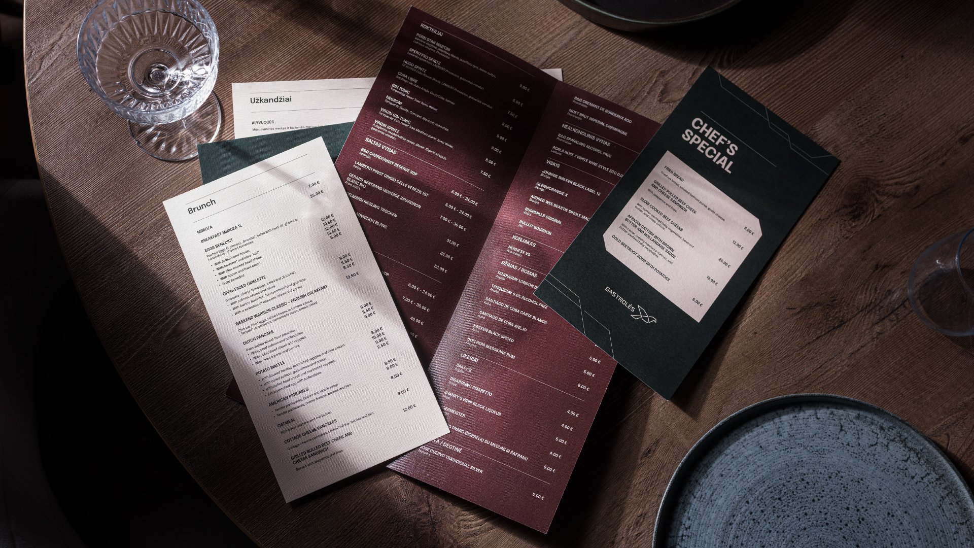
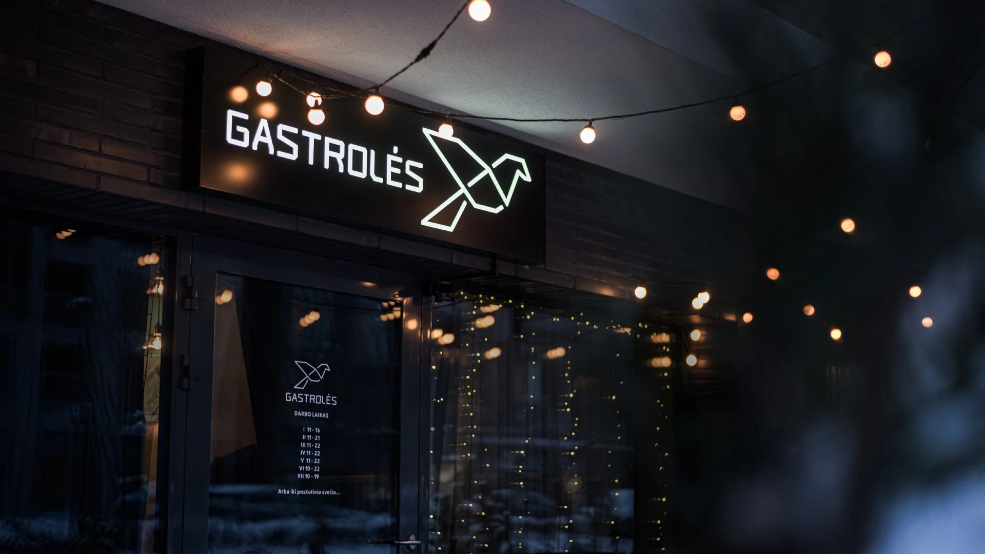
“Gastrolės” is a Lithuanian restaurant and catering brand delivering curated culinary experiences for events and on-site dining. This project focused on renewing the existing brandbook and elevating the visual identity into a more modern, elegant, and confident system.
Project goal:
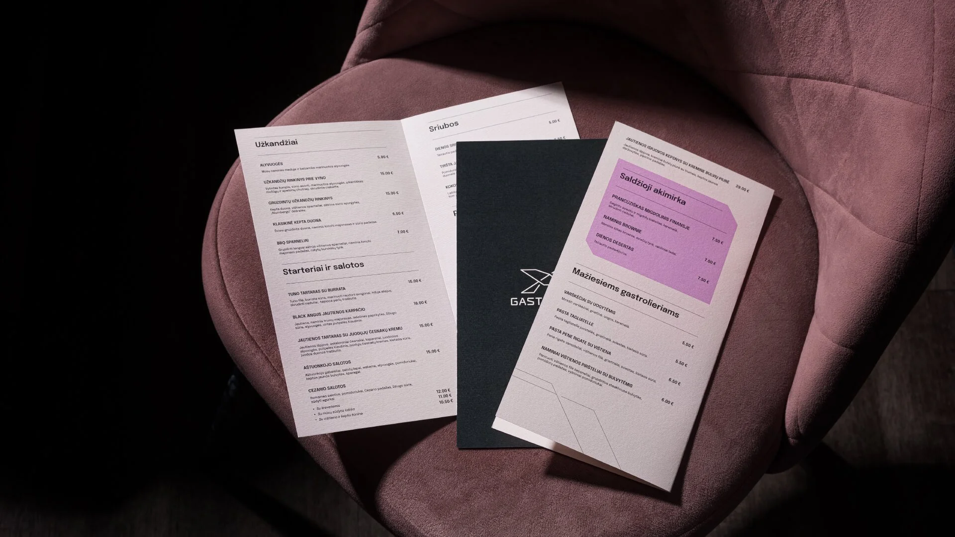
The aim was to refine the previous branding and make it sharper, stronger, and more sophisticated. The updated identity needed to better reflect the brand’s quality, professionalism, and premium positioning — while remaining adaptable across restaurant space, menus, catering materials, and digital platforms.
About the design:
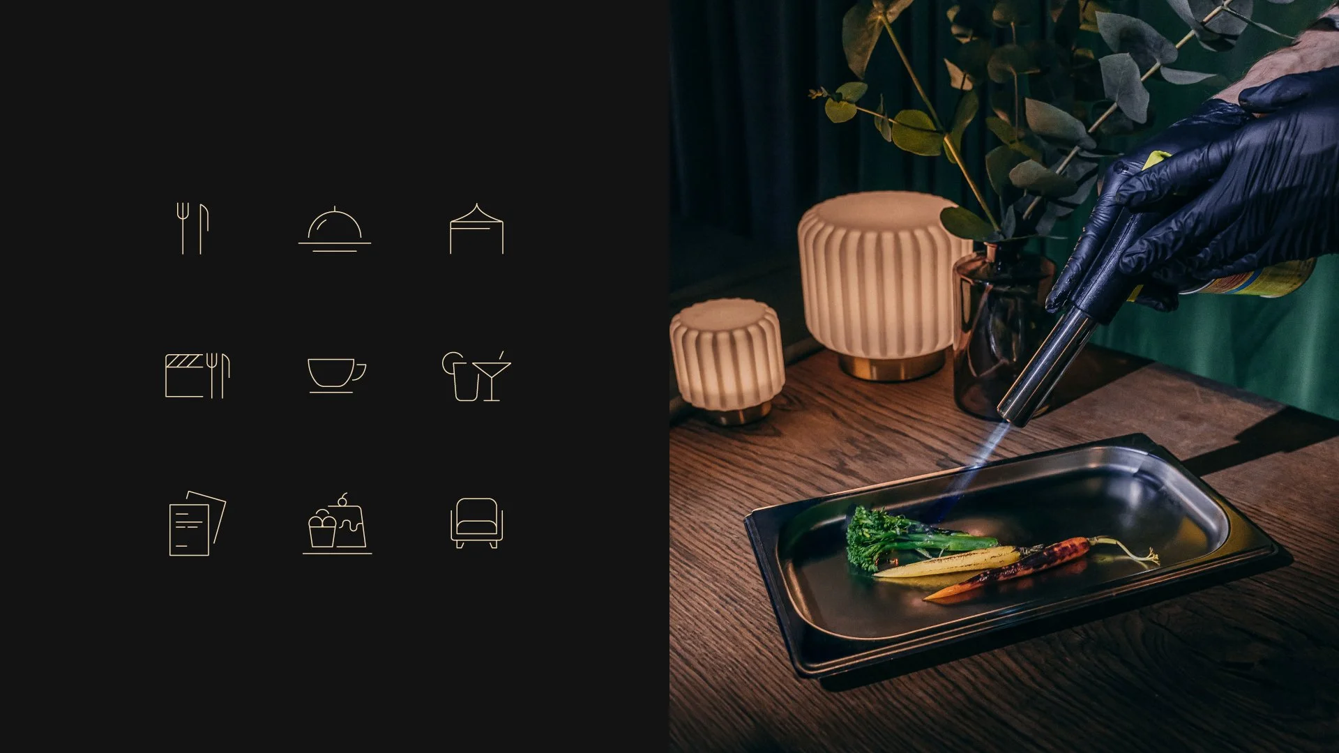
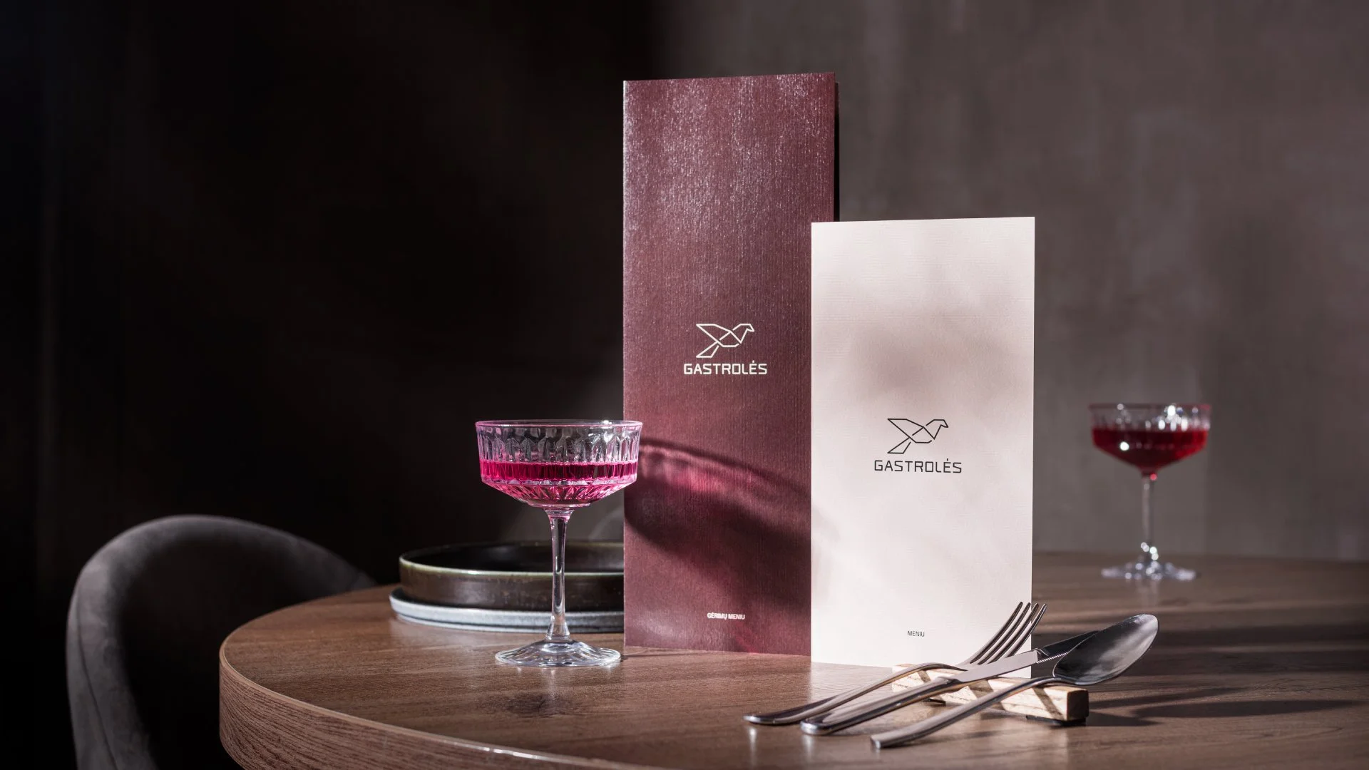
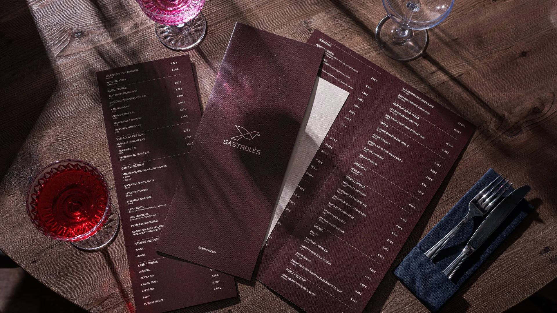
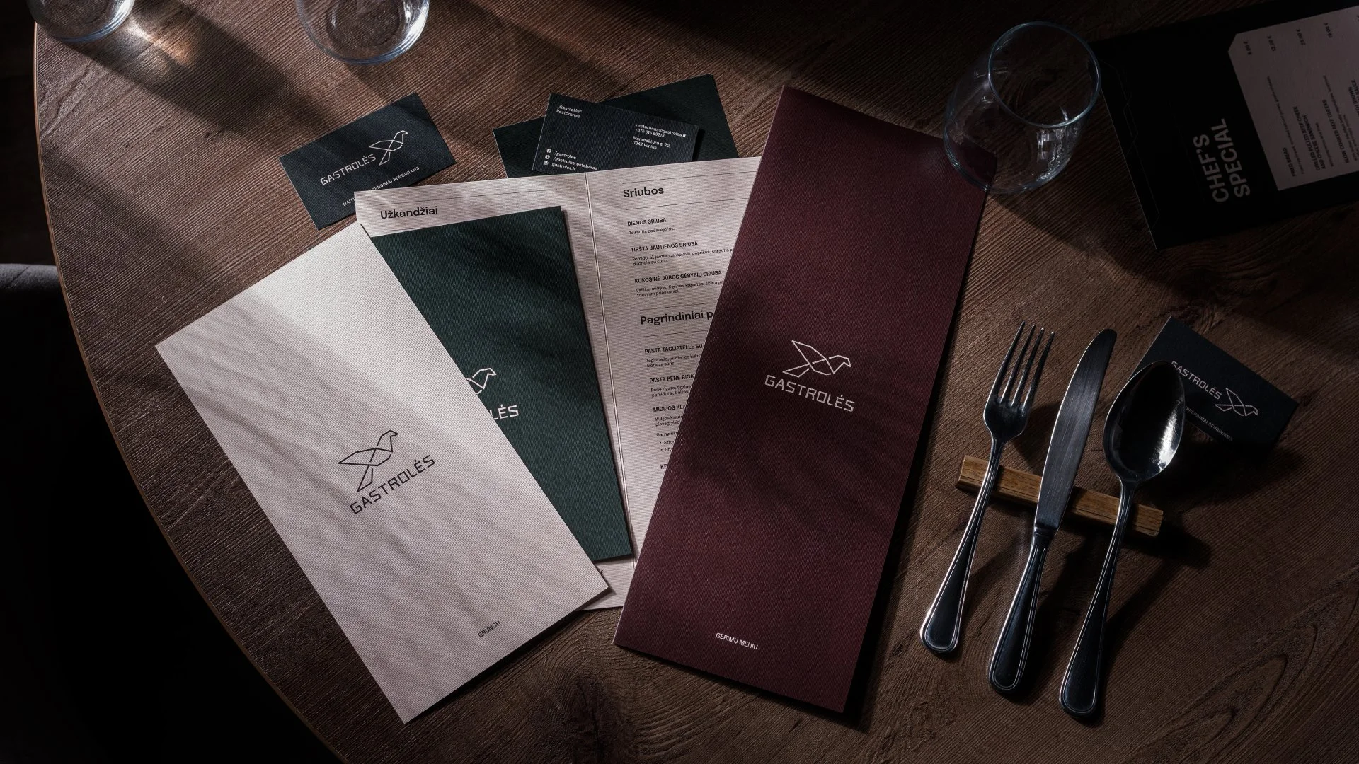
The refreshed visual system is built on clarity and structure. The logotype was refined to feel more contemporary and balanced, while the overall composition became cleaner and more intentional.
A curated color palette enhances depth and elegance, supported by modern typography that ensures readability and consistency. Clear brandbook guidelines define logo usage, spacing, color hierarchy, and layout principles — creating a cohesive and scalable identity.
Conclusion:
The updated identity represents a confident evolution. It strengthens the brand’s visual presence and establishes a refined foundation suited for both restaurant and catering environments.
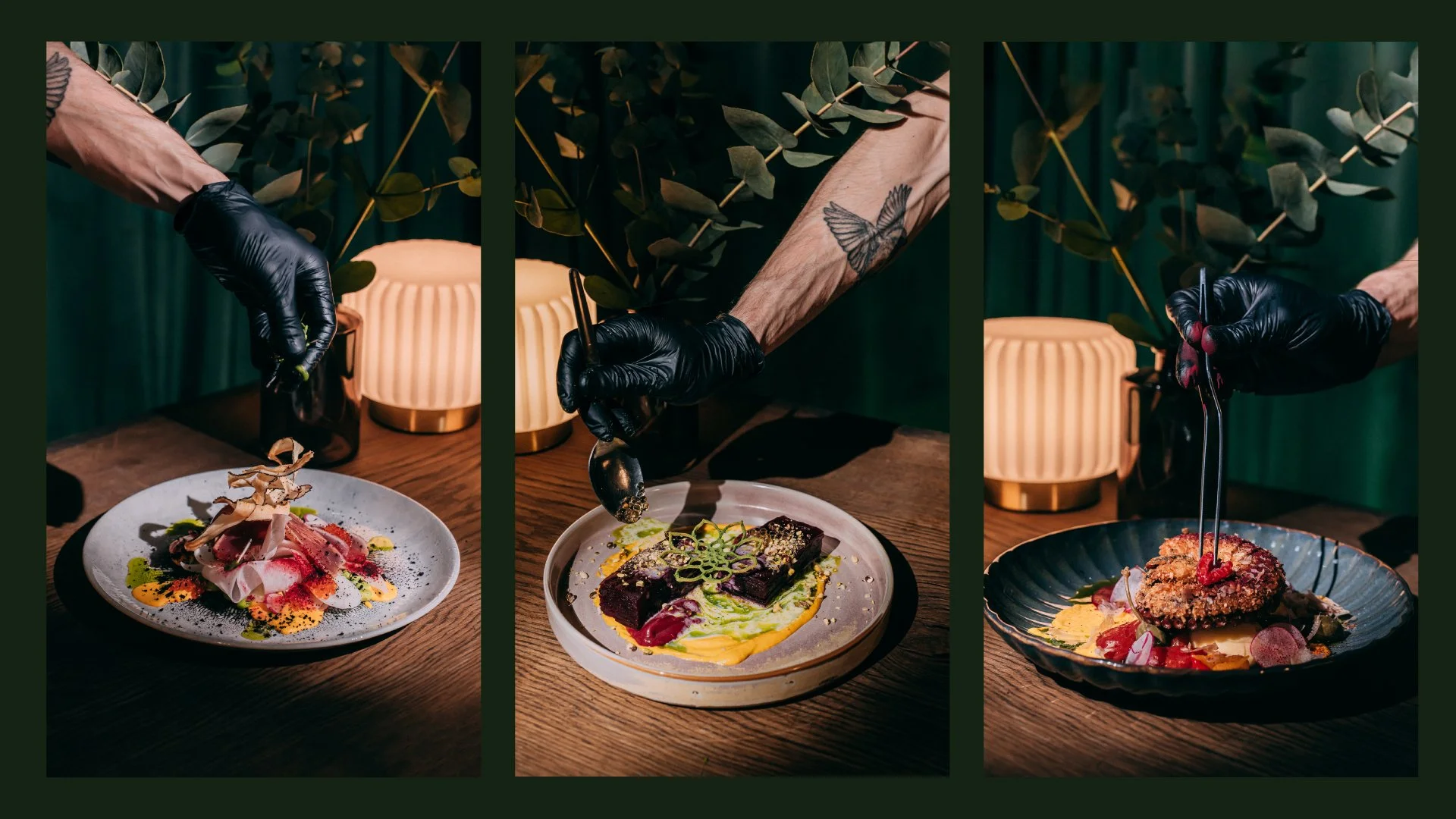
Branding photography: Packshot studio
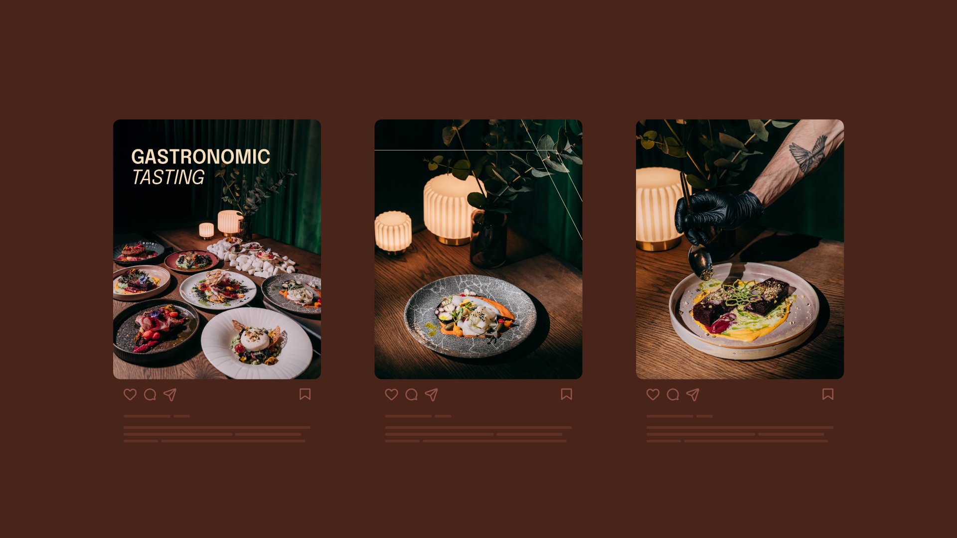
Food photography: Viktorija Korsak